SHOPPING
WHY ULTRA VIOLET ROCKS
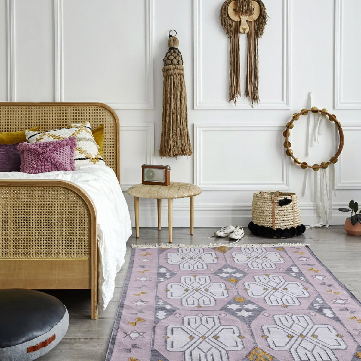
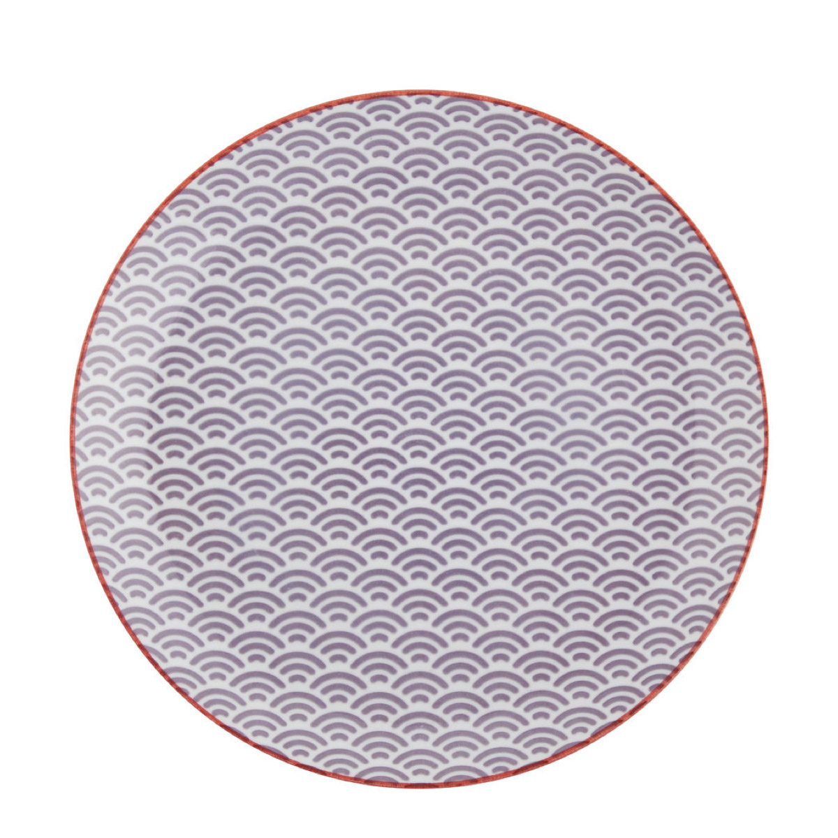
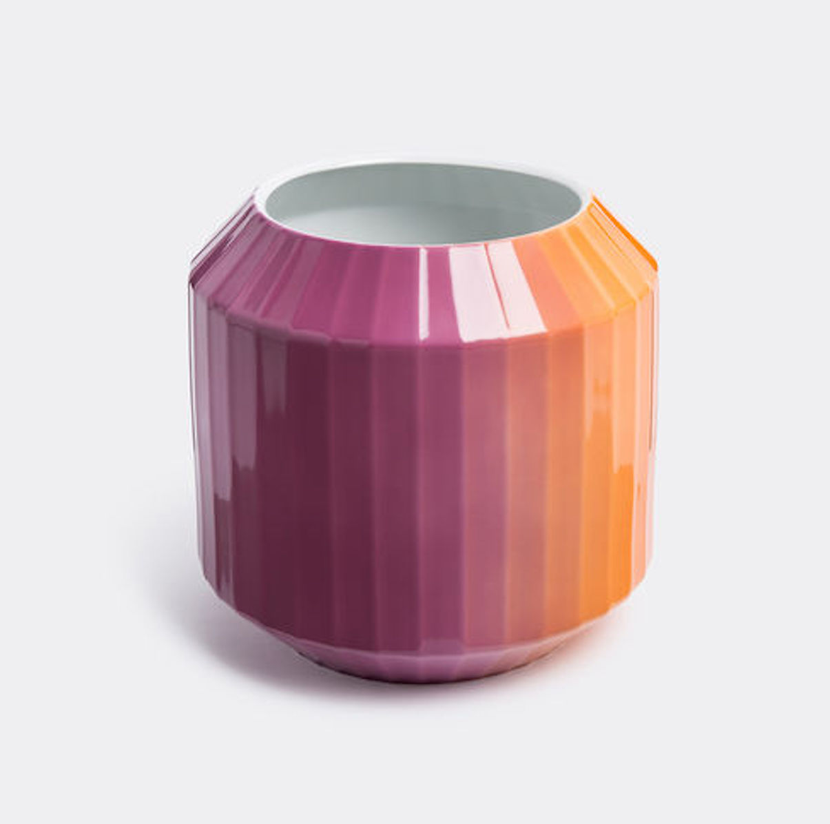
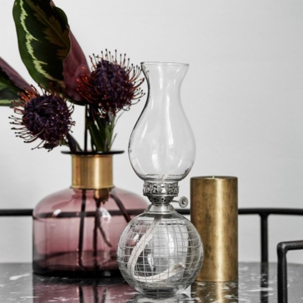
We’re all feeling a bit unsure about Pantone’s colour choice this year. I mean, Ultra Violet?! It’s bold stuff, and there aren’t many people who like to use purple in their home. That said, it’s actually a beautiful colour – particularly when you pair it with some of the other shades du jour. It looks fab with other purple or berry tones, or mix it up with other gem tones – sapphire and ruby – or give it some contrast with sage green or pale, blush pinks.
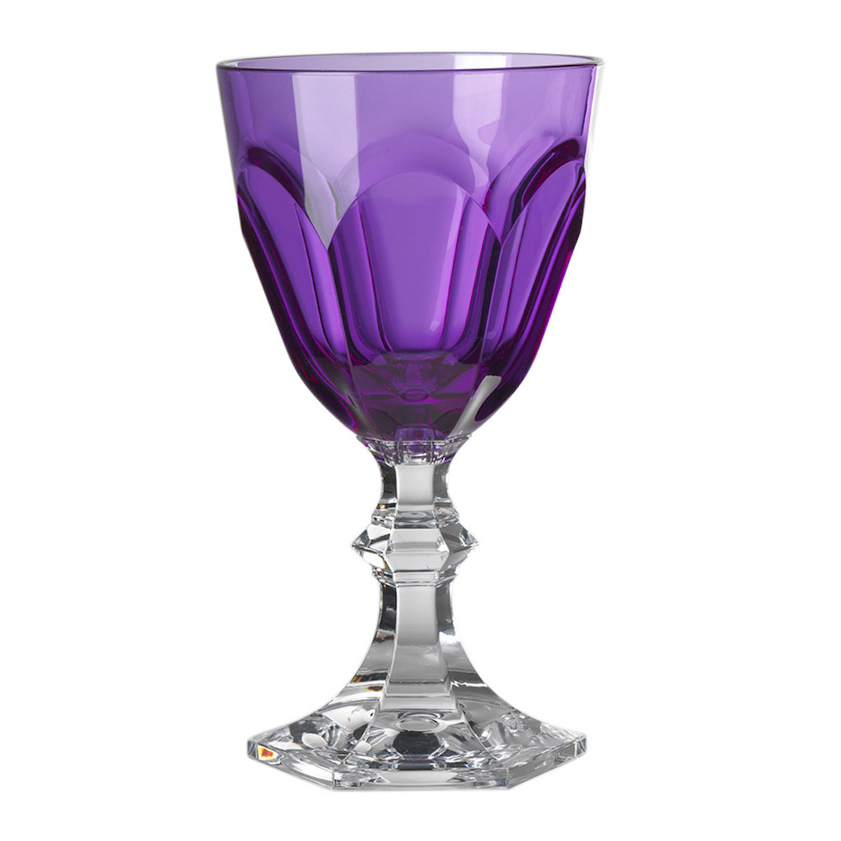
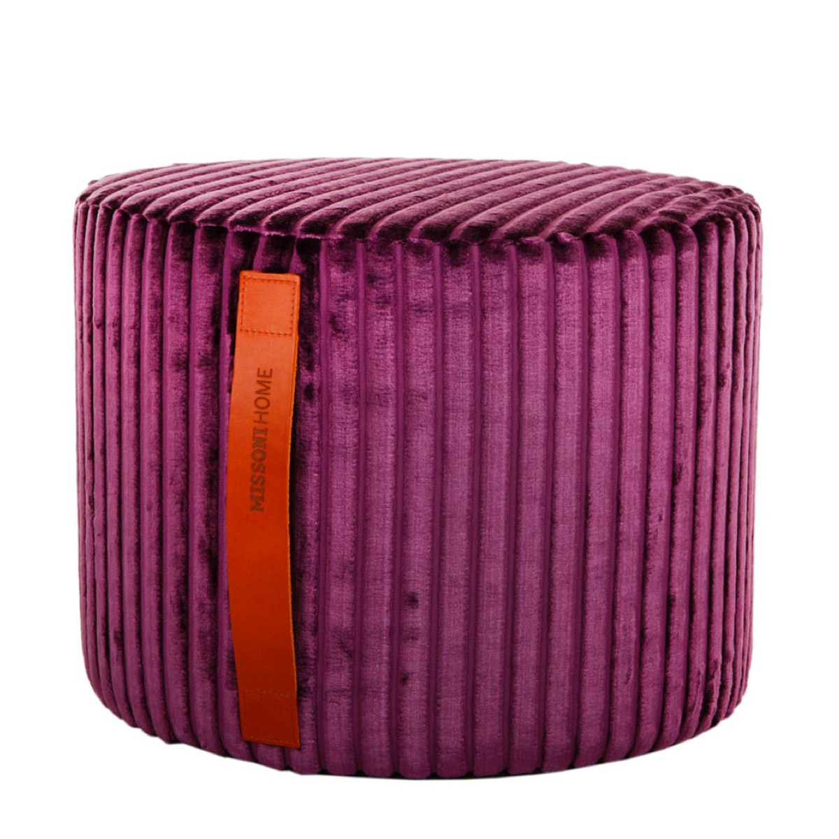
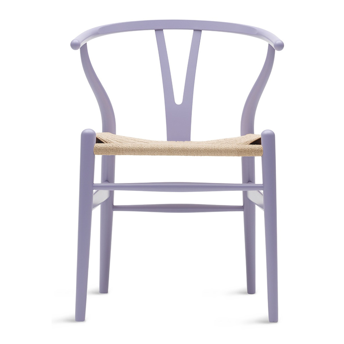
What we like about Ultra Violet is its ability to add depth to a space, and to give richness. Especially when you layer it in different materials and textures, from smooth velvet to rough pom pom finishes. It’s great with gold and brass, and with light AND dark woods. See? It’s actually surprisingly versatile.
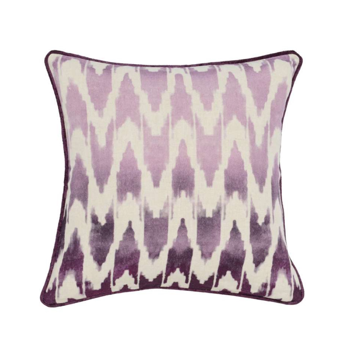
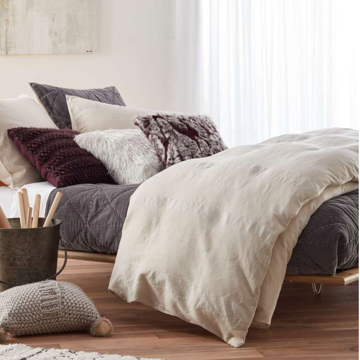
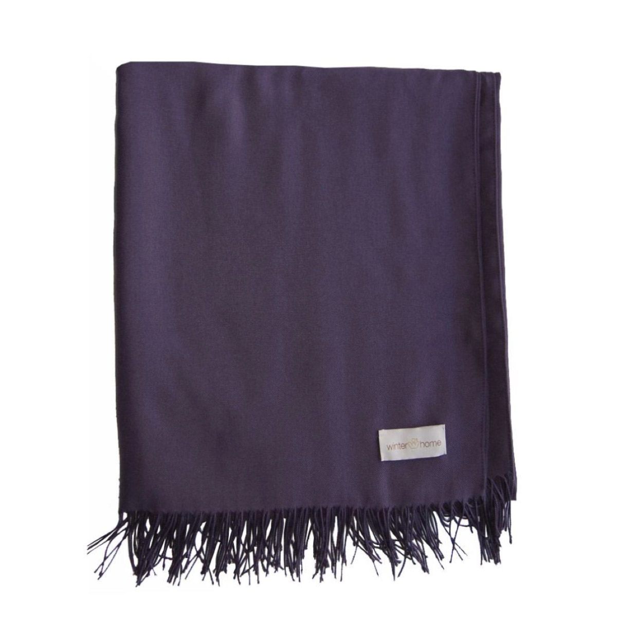
If you don’t want to go all out, but you’d like to try a pop of Ultra Violet in your home, bring it in the form of a couple of cushions against white, grey or black sofas, armchairs or bedding. Or hang a purple picture against a white wall. Or just put some purple coffee table books, or a purple agate geode, on your coffee table, and you’ll be good to go.
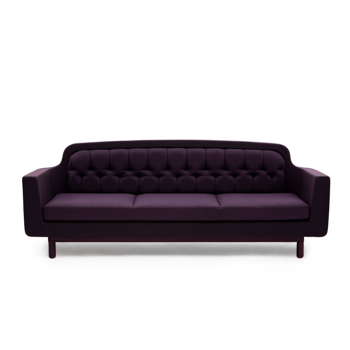
For those who feel brave, freshen up simple white spaces with a purple sofa, like Normann Copenhagen’s Onkel – and how about pairing it with emerald green velvet armchairs?
We’re hesitant to suggest painting your walls in purple… that’s not for the faint of heart, and it’s quite hard to live with. Our conclusion? Ultra Violet is a sophisticated choice for furniture and furnishings. We love it in vignettes, for dressing up nooks and corners, or for adding depth to a space. We DON’T, however, love it as a base colour. Don’t go overboard; rather, use it as a chic and fabulous accent, and you’ll be winning.


.jpg)